
When you are redesigning an application interface, there are many things you need to think about. It was the same for Agatha’s application interface redesign. In this edition of How We Did It – we’ll take you through the thinking behind the new, modern UI for Agatha applications and why the transition was critical to our customers’ success.
“We started with a clear goal, which was to make our apps more responsive and intuitive. We asked customers what they wanted, studied how they used our applications, and delivered a new UX designed around their daily work.”
This was from Gui Gerard, Agatha COO, on the process behind Agatha’s recent redesign. We even named it to the PRISM user interface because it was a huge improvement over the previous user experience.
And that’s what it’s all about, right – creating applications that work for the user. That makes it easier for them to use. This thinking is confirmed in an article on UI design:
“Minimalism and simplicity are becoming a trend now more than ever before. Scrap the clutter, figure out what’s essential to your interface and leave out anything that isn’t 100% necessary.”
So What Did This Mean For The Agatha UI?
Well, one of the most important things our customers need is a high-level view of their content from a single pane of glass (or a single screen). And that’s challenging when there’s a lot of information to provide. So what we did was create these expandable panels that appear on the screen and provide more details on selected content.
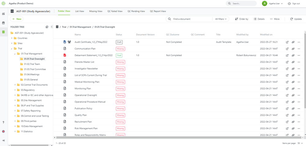
For example, Agatha Clinical, an eTMF application, is typically filled with a lot of documents and their current status (see below):
But what if you want to know more details about a couple of documents? You don’t want to have to go into a new screen to see document details, then back to the first screen and into the next one. With panels, you can select a document in the main view, and a panel opens to the right that provides detailed information for the document (see below):
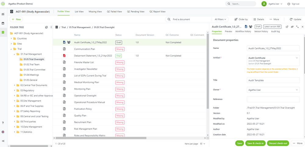
When you are ready to view the next document’s details, simply select that document and view details – the panel refreshes with information for the new document.
What’s nice to know is we’ve built the same experience for all our applications – so you have the same single screen with a panel for detailed information in all our applications.
An article on DesignShack provides tips for modern UI design, and this consistent experience is one of their tips:
“A consistent user interface is easy to use and understand. People won’t have to think so hard about how to engage with your website, making it more likely to be used.”
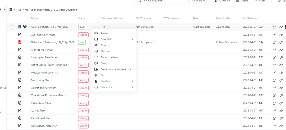
The PRISM interface also includes context-sensitive menus and functions to help streamline user actions. For example, if a user wants to start a workflow on a new document they uploaded, they can right-click to bring up a menu of options related to what they are able to do with that document.
Learning with Ease
If you want your users to learn to use your application quickly, then you don’t want to reinvent the experience from scratch. There are so many applications – both consumer and business – available that your users will already be familiar with. There are basic standards or expectations for how applications should work, and you need to keep these in mind when designing application interfaces.
“Don’t try to reinvent the wheel. Focus on what’s yet to tackle instead of trying to go around the standards already in place and expected by the user. This way, even a new interface will feel familiar and intuitive, instead of possibly becoming a nightmare to figure out, equaling more time-consuming in comparison to the eventual ‘competition.’”
—Filipe Fernandes: Digital Product Designer (Modern UI design: examples, trends, and tips)
When the Agatha design team was working on the new PRISM interface, they wanted to ensure the interface was easy to use and intuitive. So they designed following basic standards for websites and applications, including things like right-click menus, collapsible panels to increase the screen space for the primary work area, and common icons and terms.
What they found when they started testing the new interface was that new users become capable of basic navigation and completing basic tasks in as little as 15 minutes without training.
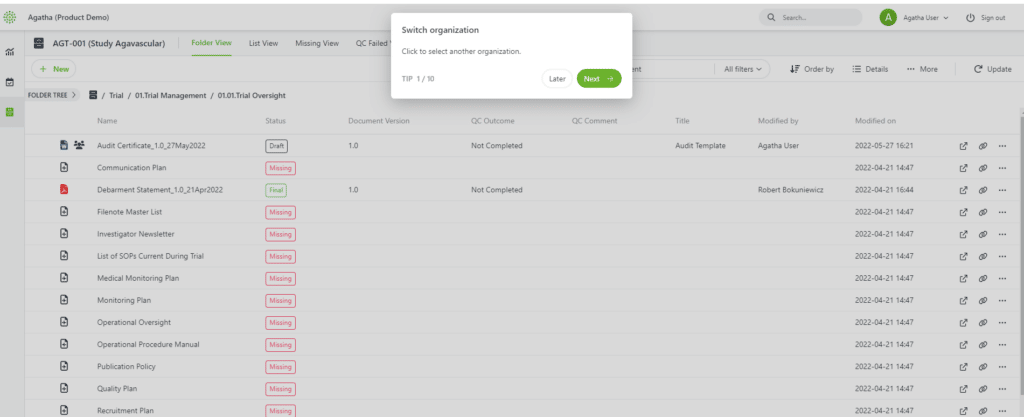
One other feature of Agatha applications is the Tour which takes users through the basics of how the application works and where everything is located. Essentially, it’s a product tour inside the application, which can be called up any time the user needs.
Helping Customers Work Effectively
The end result of all our hard work is that our customers find Agatha applications more intuitive and easy to use. And considering the work they do, we feel it’s essential to ensure the applications they use make their work easier, not harder.
“We have been using Agatha’s Clinical TMF app for managing Trial Management File (TMF) content. Usability is critical to ensure adoption of the system, and Agatha’s PRISM UI is intuitive and easy to adapt to the needs of our company. It allows us to onboard new users faster and with less training time.”
Jessica Bruno-Raiz, Senior Director of Clinical Operations at Timber Pharmaceuticals
If you’d like to learn more about Agatha’s applications or see a demo, let us know, we’d be happy to show you around.